So what’s up with $INTC and $MSFT? I never trade them, they bore me to tears, but the charts are interesting here and sometimes boring is good. The nineties are over forever for these two, but that doesn’t mean they can’t make you a little coin.
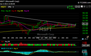
As you can see in the chart below, MSFT broke out of its downtrend line on the monthly chart that dates back to 2007. Is that significant? Probably time will tell.

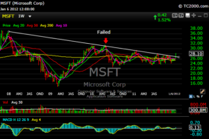
If you take a closer look at the weekly chart, MSFT tried a breakout in April 2010 and failed miserably.

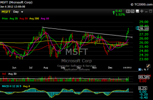
The MSFT daily shows a pretty high volume breakout.

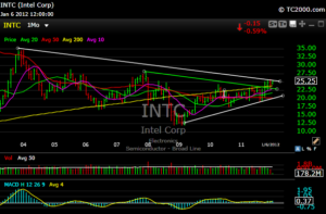
For $INTC, the green line below shows a break out from a downtrend line that dated back to around December 2007. The white downtrend line goes all the way back to 2003. If the 26 level can be breached with volume, then we’re talking 28-29.

Real movement in these two names is like pushing a refrigerator up a hill, but interesting nonetheless.
For more detailed analysis on a daily basis you can subscribe here.
